")

Today is D-day for marketers and companies world-wide. Ok, that may be a tad over-dramatic, but today is the day that Google once again updates their algorithm. This update promises to be much larger than the last much-discussed Panda update. Panda effected roughly 11 percent of websites, while today’s update promises to affect as many as 40 percent. The focus? Mobile-friendliness.
With mobile usage skyrocketing (cell phone usage has now surpassed desktop usage) Google is once again taking care of its peeps by helping those searching on a mobile device find the sites that provide the best mobile experience. It’s giving a search boost to those sites it deems “mobile friendly.” What exactly is mobile friendly? There are basically two options:
- Your site has a “mobile version.” This means that your site will detect when a visitor comes from a mobile device and serve up a different page (usually something like www.mobile.yoursite.com), optimized for the mobile device. Most non-responsive WordPress sites are equipped with this, but not all.
- Your site was designed for the mobile viewer with “responsive design.” This means your site detects the size of the screen your visitor is using and automatically resizes your content to fit that screen. Because your site was developed specifically for this functionality, it usually provides the best experience for your visitor and for your brand. Plus it has the bonus of being ready for any size screen that may come along in this new mobile-crazed world. Google recommends responsive design. I do too, just resize your browser screen to see how my blog adjusts.
Not sure if you have one of the two options for your site? Google offers a handy-dandy test to judge mobile friendliness. Just drop in your url and see what happens. Are some sites more mobile friendly than others? No. Right now, it’s black or white for Google, you either pass the test or you don’t.
What’s the big deal? Why is Google making a fuss over mobile-friendliness?
It’s all about ease of consuming content. We’ve all had the experience of getting to a website on your phone or tablet and having to pinch to enlarge the type just to read it. Then you have to work the screen back and forth as you read through. It really doesn’t make you want to continue reading. I know I don’t last long on that. And, I think less of the website/company in the process. Not what you want for your site.
Here’s a great example of my friend Kevin McKeown’s (@kevinmckeown) blog, Leadership Close Up in a responsive vs. non-responsive view. Which site would you want to visit?
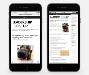
Responsive vs. Non-responsive site
If your site is not mobile friendly, is your life over? Not really. Your site is unlikely to drop off the face of the Google planet. But you may see your search rankings suffer. You’re not technically penalized for not having a mobile friendly site, but other sites that are will score priority ranking, which will effectively push your site lower. Also, it’s important to note, this is only for searches happening on a smartphone. Desktop and tablet searches will remain the same for now.
What if my site doesn’t get a lot of mobile traffic?
Now, maybe you’re thinking your Google Analytics are telling you that you only get a small percentage of traffic from mobile devices, so why should you prioritize this? Maybe there’s a reason why you only get a small amount of traffic from mobile devices. If the experience is terrible, the people won’t stay. You’re creating the problem so it’s time to make a change.
And you’re not alone. Website TechCrunch found that 44 percent of Fortune 500 companies failed the mobile friendly test.
This algorithm change signifies a significant lean toward not just ensuring the content of search results is great for searchers, but also the visceral experience. We can expect that Google will continue to prioritize providing the best search experience possible for their users. It’s all they’ve ever wanted.
So if your website and/or blogs are not mobile friendly, it better be moving up your list of priorities.
Feature photo: By Melinda Swinford via Flickr